SUPPLEMENTAL GUIDE
Page Editor
The Page Editor is the text box with a toolbar that you use to write and format content. This is a companion to the Pages guide — keep it handy to look up any button icon.
Before you begin
You do not open the Page Editor on its own — it appears inside other screens whenever you write content. The very same editor is used across Pages, News, FAQs, and Events, so once you learn it here it works the same everywhere.
To follow along, open a page for editing: Left menu › Pages, then click a page (or Add Page) and go to the Content tab. See the Pages guide for the full page workflow.
1 How the editor works
Type your text directly into the editing area, just like a word processor. To change how something looks, first select the words with your mouse, then click a toolbar button. What you see in the editor is close to what visitors will see on the finished page.
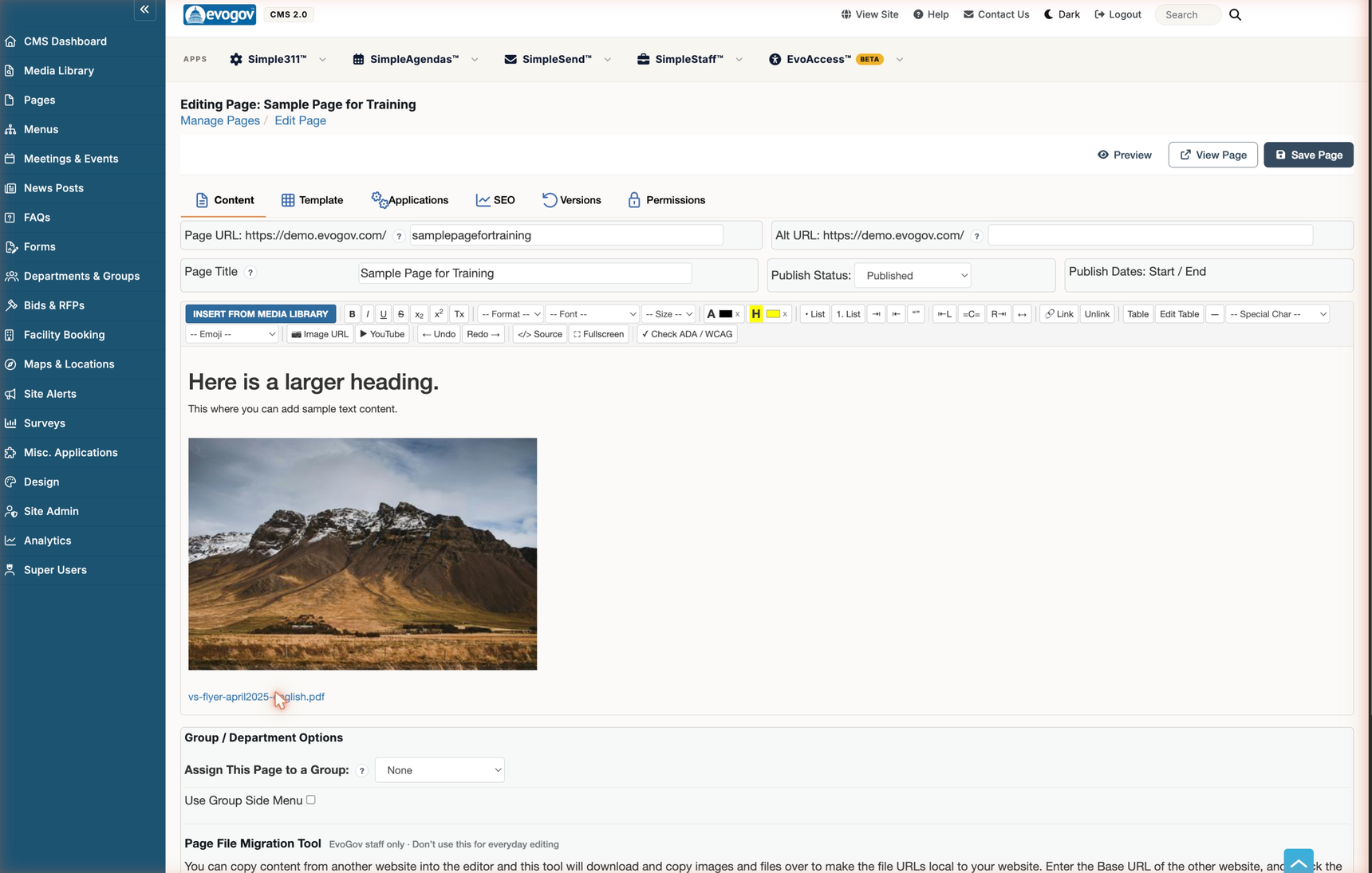
Toolbar button reference
The toolbar has two rows of buttons that run left to right across the top of the editor. Here is the toolbar, followed by what each button does.

Top row
| Button | Icon / label | What it does |
|---|---|---|
| Insert From Media Library | Blue button, far left | Opens the Media Library so you can insert an image or attach a file. See the section below. |
| Insert Component | Blue button, second from the left | Inserts a pre-designed building block (like a photo button row) published by your Design Manager. See the Inserting Components guide. |
| Bold | B | Makes the selected text bold. |
| Italic | I | Italicizes the selected text. |
| Underline | U | Underlines the selected text. |
| Strikethrough | S with a line through it | Draws a line through the selected text. |
| Subscript | x2 | Lowers the selected text below the line, as in H2O. |
| Superscript | x2 | Raises the selected text above the line, as in 1st. |
| Clear Formatting | Tx | Removes formatting from the selected text, returning it to plain body text. |
| Format | Dropdown labeled "-- Format --" | Sets the text style: normal body text or a heading level. Use headings to give your page a clear structure. |
| Font | Dropdown labeled "-- Font --" | Changes the typeface of the selected text. Most pages look best left on the theme's default font. |
| Size | Dropdown labeled "-- Size --" | Changes the size of the selected text. |
| Text Color | A with a color swatch | Changes the color of the selected text. The small x next to it clears the color. |
| Highlight | H with a yellow swatch | Puts a highlight color behind the selected text. The small x next to it clears the highlight. |
| Bullet List | • List | Starts a bulleted (unordered) list. |
| Numbered List | 1. List | Starts a numbered list. |
| Indent / Outdent | Arrows pointing to a bar | Pushes the paragraph or list item one level deeper, or brings it back out. |
| Blockquote | Quotation marks | Indents the text as a quote block, useful for highlighting a passage. |
| Align Left / Center / Align Right / Justify | L, C, and R icons with bars, then a double-headed arrow | Sets how the paragraph lines up: left edge, centered, right edge, or stretched to both edges. |
| Link | Chain-link icon | Turns the selected text into a clickable hyperlink. It asks you for the web address to link to. |
| Unlink | "Unlink" label | Removes the link from selected text, leaving the words as plain text. |
| Table | "Table" label | Inserts a table into the page. To type in a table, just click into a cell and type. You can also right-click any cell to open the table options. |
| Edit Table | "Edit Table" label | With your cursor inside a table, opens the table options: add or remove rows and columns, and more. (Right-clicking a table cell opens the same options.) |
| Horizontal Rule | A dash | Inserts a horizontal divider line across the page. |
| Special Character | Dropdown labeled "-- Special Char --" | Inserts characters that are not on your keyboard, such as the copyright symbol. |
Bottom row
| Button | Icon / label | What it does |
|---|---|---|
| Emoji | Dropdown labeled "-- Emoji --" | Inserts an emoji into the text. |
| Image URL | Picture icon | Inserts an image from a web address instead of the Media Library. Prefer the Media Library for files you want managed with your site. |
| YouTube | Play icon | Embeds a YouTube video. Paste the video's address and the player appears in your page. |
| Undo | Left arrow "Undo" | Reverses your last change. |
| Redo | "Redo" right arrow | Re-applies a change you just undid. |
| Source | Angle-brackets </> icon | Switches the editor to the raw HTML code of your page so you can edit it directly. Click it again to return to the normal view. This is an advanced option; most users never need it — see Editing the HTML of a page. |
| Fullscreen | Expand arrows | Expands the editor to fill the screen so you have more room to work; click again to shrink it back. |
| Check ADA / WCAG | Checkmark "Check ADA / WCAG" | Scans your content for common accessibility problems, such as images without descriptions, so you can fix them before publishing. |
2 Insert an image or file
Place your cursor where you want the image or link to go, then click the Media button (the picture icon). The Media Library opens so you can pick an existing file or upload a new one. Select the file to drop it into your content.
Editing the HTML of a page
"How do I edit my HTML?" has two answers, depending on whose HTML you mean. Most of the time you want the first one.
1 The HTML of one page's content: the Source button
Every page, news post, FAQ, and event stores its content as HTML behind the scenes. To see or change that code, open the item for editing, go to the Content tab, and click the Source button (the angle-brackets </> icon on the bottom row of the toolbar). The formatted view is replaced by the page's HTML code. Make your changes, click Source again to return to the normal view, then Save the page as usual.
Use this when you need to paste an embed code from another service (a form, a map, a video that is not on YouTube), add an attribute the toolbar has no button for, or clean up formatting that the toolbar cannot reach.
2 The HTML of the whole website design: Design Admin
The header, footer, navigation, and page layouts that wrap every page live in your site's design templates, not in any single page. Those are edited by a Design Manager under Site Admin › Design Admin › Templates. The Design Admin guide walks through it.
A change there affects every page that uses that template, so it is limited to the Design Manager role.
Next steps
- Return to the Pages guide for the full page workflow — URLs, publishing, and departments.
- Get your images and documents ready in the Media Library.
- Drop a pre-designed building block into your content with the Inserting Components guide.
- Need to change the header, footer, or layout around your pages? See the Design Admin guide.